It’s been more than six months since we launched prestashop-sync.com. (Despite the fact that the domain was registered only on the 27th of May, before that the service had run on Google App Engine domain, prestashop-sync.appspot.com)
Throughout this time, we gradually, step by step, tried to make the service better and get rid of various bugs discovered by our kind users.
Initially, the service did not possess any design, development was chaotic, interface accumulated more and more new elements but the old ones did not intend to leave.
You can see this initial version of the service interface on the screenshot below:

Yes, it doesn’t look very ugly, but it definitely has shortcomings. The interface was made from ordinary rectangular blocks (albeit with rounded corners), the same buttons, plus some other stuff, “successfully” borrowed from other sites. And the most terrible was non-attractive look site color theme - shades of gray. The site has slowly began to turn into a mess, and therefore it was decided to develop a new design from scratch, but try to preserve and improve the original service workflow at the same time.
We have invited a web designer, described him the purpose of the service, its functionality, showed him sites that we like, and asked for a couple of sketches. The first attempt, as usual, came out lumpy (only on russian, sorry for that:)):

I forgot to tell the designer that we want to see the interface in the original PrestaShop.com color scheme, moreover the overall impression on this sketch was quite ambiguous, so we continued to work on the design.
The second one appeared much better and we decided to give it a try:

Then we continued to work on details to make the service as far as possible convenient and understandable for our users.
Now I’ll dwell on the various features of the new interface and show how it differs from the old one:
- **PrestaShop **color scheme**. ** I've already mentioned this earlier, now in detail: we decided to get rid of gray shades dominance and make something more bright, so we considered the PrestaShop color scheme and found it to be quite good and reasonable, because it gives the impression of some relation between our service and PrestaShop.
- **Service feature block**:
 In this block we have introduced a possibility to dynamically change slides to accommodate several paragraphs of text. Also, to not bother our users that have already read it, we have added a button to collapse block into a small semi-transparent line. Moreover, the state of the block will persist across visits so users don't have to collapse it again.
 - **Navigation help steps right besides functional blocks.**
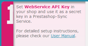
Help on how to use service had already present in the first service incarnation, but first, its placement wasn't perfect at all, and second, we couldn't put any reasonable text in the space allotted for it. So we had split this block into smaller pieces and added corresponding descriptions to each functional block in the new version. We have also added numbers on these blocks to explicitly define the sequence to follow:
- **New update product quantity button.**
In the previous service version the indicator of upgrade process for a particular product was made in the form of a rotating element next to the "**update**" button:

 In the new version we have gone further - because the button is not needed until the update is finished, we have combined these elements. The result turned out to be nice and easy:


- Every shop is a shop list has its **status indicator**: **green **- means everything is ok and you can work with the shop, **red **- the error has occurred and you can't work with the shop right now. Previously, we had a separate status update button in a column called "**actions**". But why do we need a separate button to update the status if it is possible to merge then into one element?
Thus we have reduced the diversity of different actions and indicators while keeping the ease of use:

- **Trapezoid buttons.**
Another our innovation - non-standard buttons in the shape of a trapezoid. Implementation of this element was one of the most difficult tasks, but they look very impressive:

- **Article count.**
The idea is pretty simple - to let our visitors immediately see the number of articles on our site. While the number of articles is not very large - it may be quite reasonable: